반응형
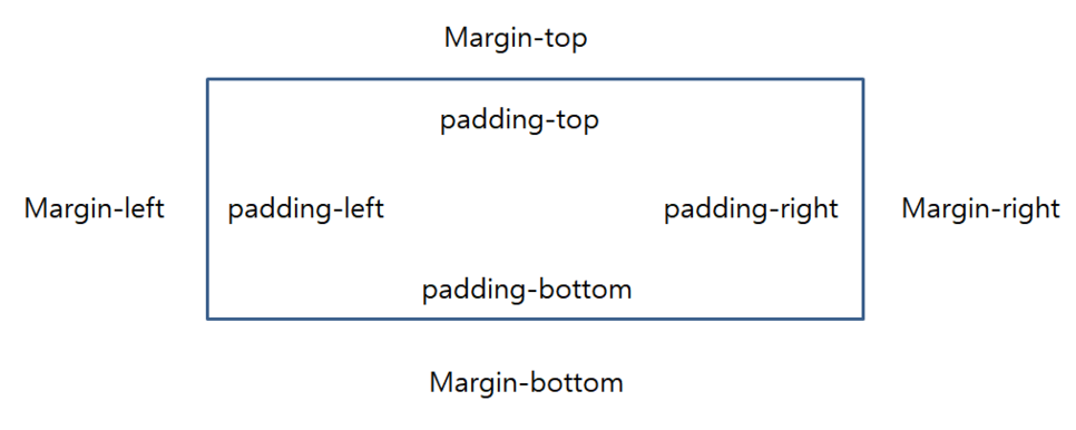
요소간에 여백을 줘야 하는 경우 margin, padding을 사용하여 공간을 만들 수 있다.
margin은 자신을 기준으로 외부를 padding은 자신을 기준으로 내부의 여백을 만든다.
사용법
<style>
div{
  margin-top: 20px;
  margin-right: 10px;
  margin-bottom: 15px;
  margin-left: 10px;
}
</style>
<div></div>
위 사용법처럼 "-위치별"로 지정하여 줘도 되지만 저렇게 모든 위치를 설정해야 할 경우 한줄로 표현이 가능하다.
한줄로 표현하기
<style>
div{
  margin: 20px 10px 15px 10px;
}
</style>
<div></div>
위에서 표현한 방식과 동일한 결과를 얻을 수 있다.
이것을 통해 순서대로 위 오른쪽 아래 왼쪽 방향으로 값이 처리되는 걸 알 수 있다.
시계방향으로 돌아간다고 숙지하면 좋을 것 같다.
margin 값이 3개인 경우
<style>
div{
  margin: 20px 10px 15px;
}
</style>
<div></div>
이번엔 4개에서 3개짜리 표현방법이다.
똑같이 시계방향으로 읽으면 된다.
상단 20px margin
우측 20px margin
하단 20px margin
좌측은 여백값이 없는 상태이다.
margin 값이 2개인 경우
<style>
div{
  margin: 20px 10px;
}
</style>
<div></div>
이번엔 시계방향처럼 읽지만 상단 하단이 동일값, 좌측 우측이 동일값으로 표현된다.
상단 20px margin
우측 10px margin
하단 20px margin
좌측 10px margin
margin 값이 1개만 있는 경우
<style>
div{
  margin: 10px;
}
</style>
<div></div>
모든 영역이 동일한 사이즈로 여백이 지정된다.
상단, 우측, 하단, 좌측 10px margin
padding또한 margin과 사용법은 동일하다.
<style>
div{
  padding: 20px 10px 15px 10px;
}
</style>
<div></div>
반응형
'WEB > HTML,CSS' 카테고리의 다른 글
| HTML - Form 태그, Input 태그 자동완성 해제하기 (0) | 2019.09.06 |
|---|---|
| CSS - display : flex를 통한 수직, 수평 정렬하기 (0) | 2019.09.06 |
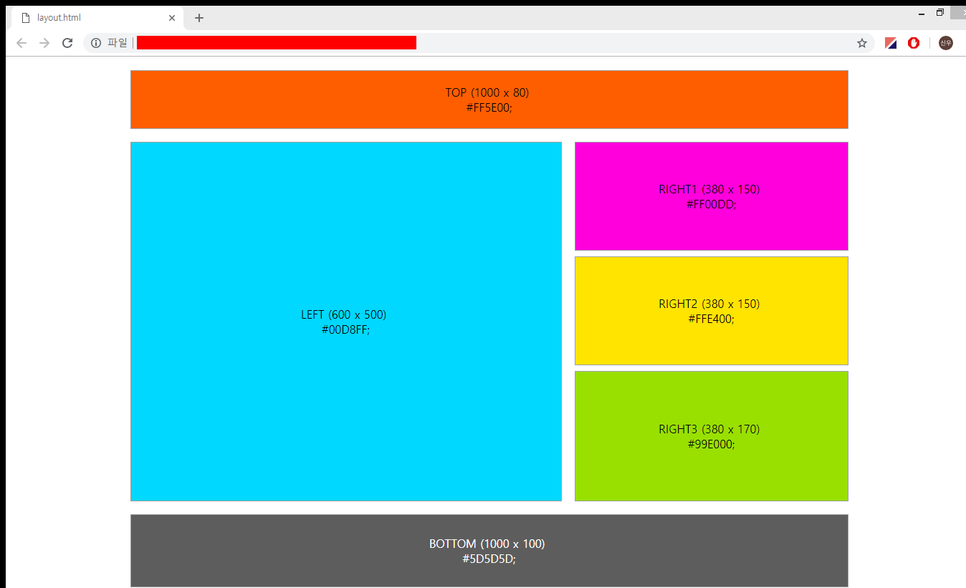
| HTML, CSS - POSITION 속성을 활용한 레이아웃 나누기 (4) | 2019.09.06 |
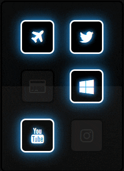
| HTML,CSS - Bootstrap-cdn 활용한 네온사인 버튼 (0) | 2019.09.06 |
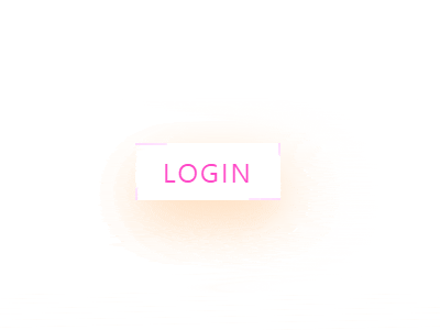
| HTML, CSS - 테두리선이 돌아가는 버튼 만들기 (0) | 2019.09.06 |