반응형
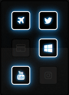
BootStrap cdn을 활용하여 네온사인 버튼을 만들어 봅니다.
index.html
<!DOCTYPE html>
<html>
<head>
<meta charset="UTF-8">
<!-- Bootstrap-cdn 적용 -->
<link href="https://stackpath.bootstrapcdn.com/font-awesome/4.7.0/css/font-awesome.min.css" rel="stylesheet" integrity="sha384-wvfXpqpZZVQGK6TAh5PVlGOfQNHSoD2xbE+QkPxCAFlNEevoEH3Sl0sibVcOQVnN" crossorigin="anonymous">
<link rel="stylesheet" type="text/css" href="CheckButton.css" />
<title>CheckButton</title>
</head>
<body>
<ul>
	<li>
		<label>
			<input type="checkbox" name="">
			<div class="icon-box">
                <!-- 이미지 적용(비행기) -->
				<i class="fa fa-plane" aria-hidden="true"></i>
			</div>
		</label>
	</li>
	<li>
		<label>
			<input type="checkbox" name="">
			<div class="icon-box">
                <!-- 이미지 적용(트위터) -->
				<i class="fa fa-twitter" aria-hidden="true"></i>
			</div>
		</label>
	</li>
	<li>
		<label>
			<input type="checkbox" name="">
			<div class="icon-box">
                <!-- 이미지 적용(신용카드) -->
				<i class="fa fa-credit-card" aria-hidden="true"></i>
			</div>
		</label>
	</li>
	<li>
		<label>
			<input type="checkbox" name="">
			<div class="icon-box">
                <!-- 이미지 적용(윈도우) -->
				<i class="fa fa-windows" aria-hidden="true"></i>
			</div>
		</label>
	</li>
	<li>
		<label>
			<input type="checkbox" name="">
			<div class="icon-box">
                <!-- 이미지 적용(유튜브) -->
				<i class="fa fa-youtube" aria-hidden="true"></i>
			</div>
		</label>
	</li>
	<li>
		<label>
			<input type="checkbox" name="">
			<div class="icon-box">
                <!-- 이미지 적용(인스타그램) -->
				<i class="fa fa-instagram" aria-hidden="true"></i>
			</div>
		</label>
	</li>
</ul>
</body>
</html>
CheckButton.css
*{
  margin: 0px;
  padding: 0px;
}
body{
	display: flex;
	justify-content: center;
	align-items: center;
	height: 100vh;
	background-color: #111;
}
ul{
	position: relative;
	display: flex;
	justify-content: center;
	align-items: center;
	flex-wrap: wrap;
	border: 3px solid #000;
	border-radius: 10px;
	padding: 20px 0;
	box-sizing: border-box;
	overflow: hidden;
	width: 240px;
	background: linear-gradient(0deg, #000000, #0c0c0c);
}

ul:before{
	content: '';
	position: absolute;
	width: 100%;
	height: 100%;
	background: rgba(255,255,255,.05);
	bottom: -50%;
	pointer-events: none;
	z-index: 1;
}
ul li{
	position: relative;
	list-style: none;
	text-align: center;
	margin: 15px;
}
ul li label{
	position: relative;
}
ul li label input[type="checkbox"]{
	position: absolute;
	opacity: 0;
	cursor: pointer;
}
ul li label .icon-box{
	width: 60px;
	height: 60px;
	background-color: #101010;
	display: flex;
	justify-content: center;
	align-items: center;
	border: 3px solid #000;
	border-radius: 10px;
	transition: 0.5s;
}

ul li label .icon-box .fa{
	font-size: 30px;
	color: #222;
	transition: 0.5s;
}
ul li label input[type="checkbox"]:checked ~ .icon-box{
	background-color: #000;
	border: 3px solid #fff;
	box-shadow: 0 0 10px rgba(33,156,243,.5),
				0 0 20px rgba(33,156,243,.5),
				0 0 30px rgba(33,156,243,.5);

}
ul li label input[type="checkbox"]:checked ~ .icon-box .fa{
	color: #fff;
	text-shadow: 0 0 10px rgba(33,156,243,.8),
				 0 0 10px rgba(33,156,243,1);
}
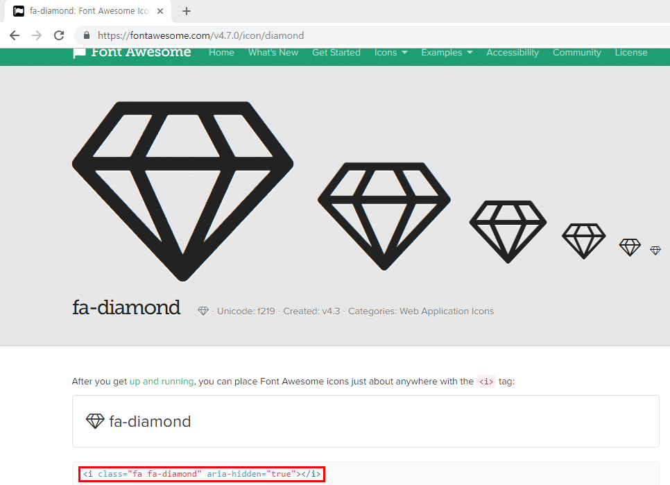
다른 아이콘들을 확인 하고 싶으면
https://fontawesome.com/v4.7.0/icons/
Font Awesome Icons
Get 1535 icons right now with FA Free, plus another 7020 icons with Pro, which also gets you another 53 icon category packs as we finish them! Our all-new SVG with JavaScript gives you all the power of SVG without the usual hassle. Ligatures for easier des
fontawesome.com
위 사이트로 접근하여 원하는 이미지로 적용시키면 된다.
아래 빨간색으로 처리된 class부분을 변경해주면 된다.
반응형
'WEB > HTML,CSS' 카테고리의 다른 글
| CSS - display : flex를 통한 수직, 수평 정렬하기 (0) | 2019.09.06 |
|---|---|
| CSS - margin, padding 속성 (0) | 2019.09.06 |
| HTML, CSS - POSITION 속성을 활용한 레이아웃 나누기 (4) | 2019.09.06 |
| HTML, CSS - 테두리선이 돌아가는 버튼 만들기 (0) | 2019.09.06 |
| HTML, CSS - 사각형이 올라오는 배경(소스) (0) | 2019.09.06 |