반응형

position값을 사용하여 처리하면 center같은 옵션이 먹지 않는데, 이런 경우에는 약간의 연산이나 transform옵션을 활용하면 중앙 정렬 또는 가운데 정렬등을 처리 할 수 있습니다.

transform을 통한 센터정렬, 중앙정렬하기


HTML - 예시 데이터

<!DOCTYPE html>
<html lang="en">

<head>
    <meta charset="UTF-8">
    <meta name="viewport" content="width=device-width, initial-scale=1.0">
    <title>Centered</title>
</head>
<style>
    * {
        margin: 0px;
        padding: 0px;
    }

    .popup {
        width: 300px;
        height: 450px;
        border: 1px solid gray;
        background-color: aquamarine;
        position: absolute;
        top: 0%;
        left: 0%;
    }
</style>

<body>
    <div class="popup"></div>
</body>

</html>


샘플

이러한 형태의 div를 중앙 정렬을 또는 가운데 정렬을 처리해보겠습니다.


1. top, left에 50%씩 처리하여 가운데로 밀어넣기

.popup 클래스에 top, left를 50퍼로 수정합니다.

.popup {
    width: 300px;
    height: 450px;
    border: 1px solid gray;
    background-color: aquamarine;
    position: absolute;
    top: 50%;
    left: 50%;
}


전체의 가운데 위치 기준으로 생성되었다.

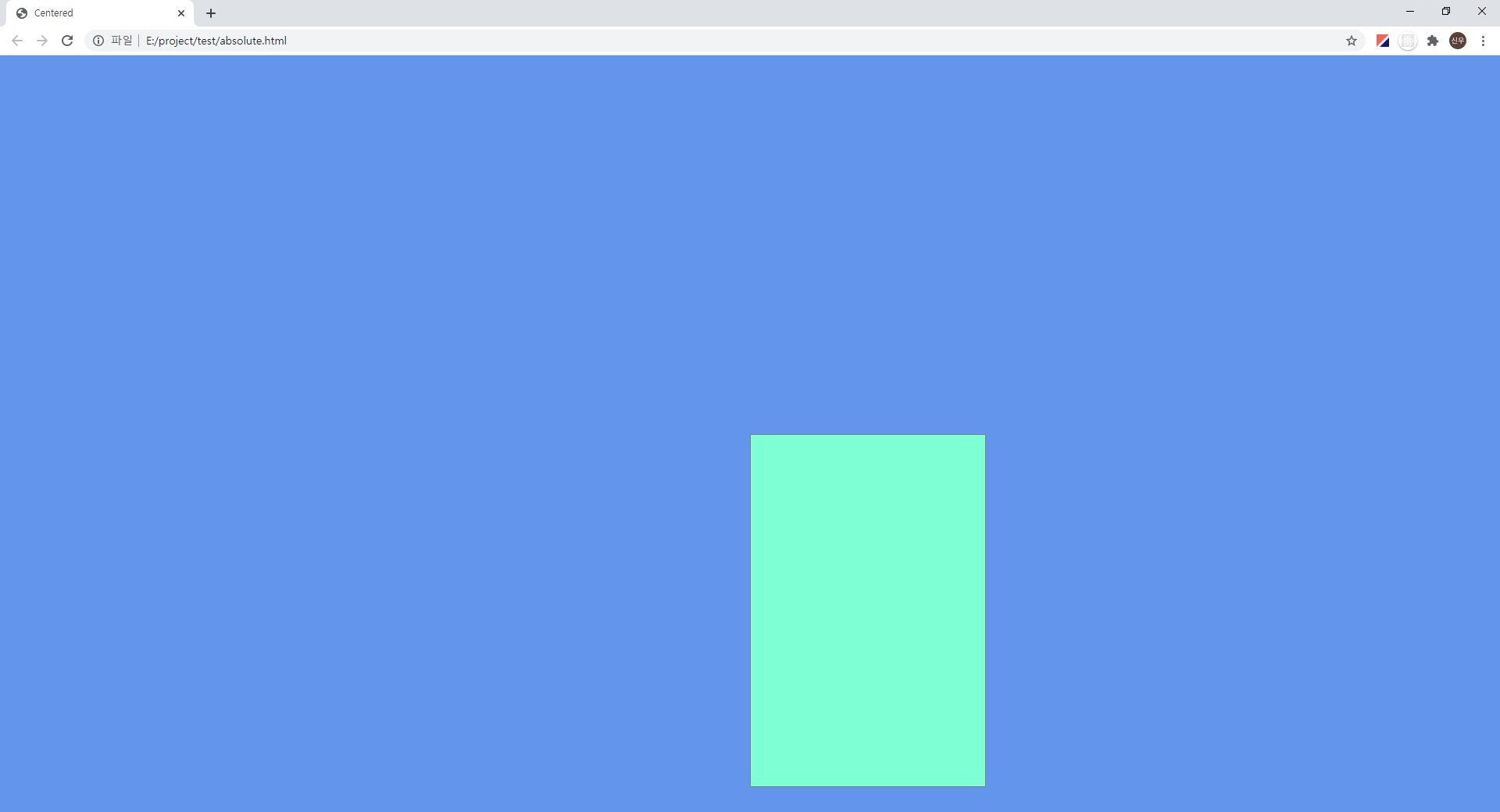
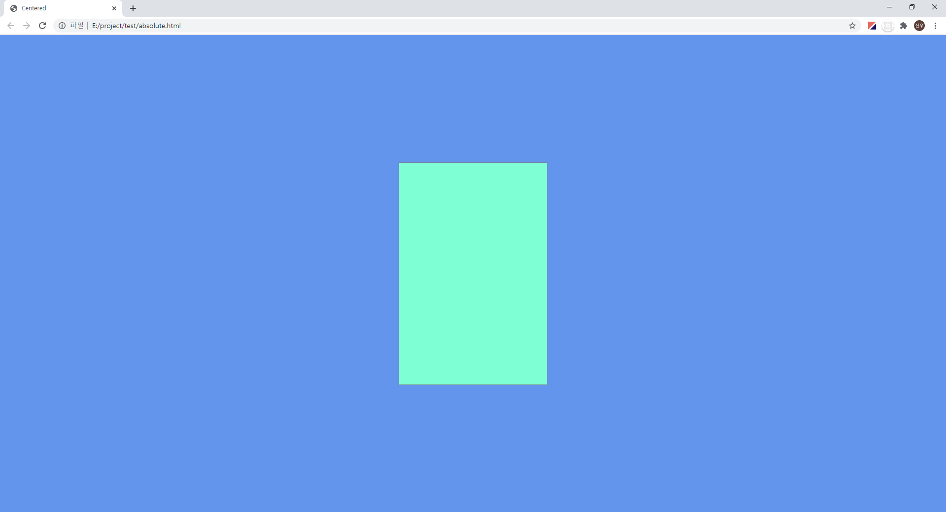
중앙을 기준으로 가로 300px, 높이 450px짜리 div가 처리된것을 볼 수 있습니다.

이부분에서 transform을 추가하여 완벽한 중앙 정렬을 처리합니다.


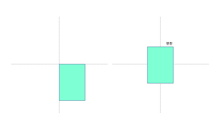
2. transform으로 요소 사이즈만큼 반대로 이동시키기

.popup {
    width: 300px;
    height: 450px;
    border: 1px solid gray;
    background-color: aquamarine;
    position: absolute;
    top: 50%;
    left: 50%;
    transform: translate(-50%, -50%);
}

중앙 정렬!


원리는 아래와 같습니다.

개체의 넓이와 높이만큼 50퍼센트를 반대로 이동합니다.


가운데 정렬

높이는 30px만큼 고정으로 띄우고 가운데만 정렬하고자 할때는 아래와 같이합니다.

.popup {
    width: 300px;
    height: 450px;
    border: 1px solid gray;
    background-color: aquamarine;
    position: absolute;
    top: 30px;
    left: 50%;
    transform: translate(-50%, 0%);
}


높이는 고정 시키고 가운데 정렬


translate의 첫번째 x축인 가로축만 50퍼센트만큼 당겨와서 가운데 정렬을 처리할 수 있습니다.

반응형
반응형

checkbox는 자주사용하는 html tag이지만 브라우저별로 약간의 사이즈 차이와 이미지가 차이가 있다보니 css를 통해 통일화를 시키고 싶지만 CSS를 통해 checkbox를 꾸미는것은 불가능하기 때문에 이미지로 대체하여 동작시키는 경우가 많다.


label태그를 사용하면 checkbox를 꾸밀 수 있는데 코드는 아래와 같다.


checkbox.html

<input type="checkbox" id="myCheck">
<label for="myCheck"></label>

id를 지정해주고 label태그는 바라볼 checkbox와 연결해준다.


css

input[type="checkbox"]+label {
    display: block;
    width: 24px;
    height: 24px;
    background: url('./images/check-off.png') no-repeat 0 0px / contain;
}

input[type='checkbox']:checked+label {
    background: url('./images/check-on.png') no-repeat 0 1px / contain;
}

input[type="checkbox"] {
    display: none;
}

+를 통해 바로 뒤에 오는 label태그를 같이 선택시킨다.

그런 다음 기본이미지("체크되지 않은 이미지")를 배경으로 처리하고 :checked속성을 추가하여 선택된 이미지("체크 이미지")를 넣는다.


마지막에 원래 이미지인 checkbox는 숨긴다.


동작정보

이미지로 대체된 기본 체크박스

변경된 체크박스

반응형
반응형

HTML 페이지에서 반응형 작업을 한 후 모바일에서 테스트를 하는도중 input text속성 태그를 모바일환경에서

선택하게 되면 키 자판이 일반 입력 배열이 아닌 숫자자판이 나오게 하고 싶었다.

이러한 경우엔 type 값을 tel 속성으로 지정해주면 모바일환경에서 숫자자판이 먼저 나오는 걸 볼 수 있다.


<input type="tel" value="">


https://www.w3schools.com/tags/att_input_type_tel.asp


HTML input type="tel"

HTML ❮ HTML type attribute Example Define a field for entering a telephone number: Telephone:

Try it Yourself » Definition and Usage The

defines a field for entering a telephone number. Note: Browsers tha

www.w3schools.com


같이 사용할만한 자바스크립트 입력제한 방법이다.

html

<input type="tel" value="" telOnly="true">


javascript

//input tel telOnly 속성이 있으면 숫자, '-'만 입력받기
$(document).on("keyup", "input[telOnly]", function() {$(this).val( $(this).val().replace(/[^0-9-]/gi,"") );});


자바스크립트 keyup 이벤트를 통해 입력된 데이터를 replace 함수를 통해 변경한다.

해당 자바스크립트를 설정하면 숫자 및 '-'만 입력이 가능하다.

반응형
반응형

HTML5의 경우 입력창의 데이터를 자동완성 해주는 기능이 탑재되어 지원됩니다.

반대로 자동완성을 끄고 싶은 경우가 있는데 이러한 경우 autocomplete="off" 처리를 통하여

쉽게 해제 할 수 있습니다.

input태그에 처리)

<input type="tell" value="" maxlength="11" autocomplete="off"/>


또 해당하는 input 타입의 태그들이 form태그 안에 있다면 form태그에 속성 처리를 통해

한번에 모든 form태그 내부 입력 창을 제어 할 수 있습니다.

form태그에 처리)

<form  autocomplete="off">
  <input type="text" name="name" value="" maxlength="5"/>
  <input type="tell" name="phone" value="" maxlength="11"/>
  <input type="tell" value="mobile" maxlength="11"/>
</form>


반응형
반응형

css display 속성 중 flex 속성이 존재한다.

flex 속성을 활용하여 정렬하는 방법을 알아보겠다.


flex-direction 속성을 통해 수평 정렬 (row)

<!DOCTYPE html>
<html lang="en" dir="ltr">
  <head>
    <meta charset="utf-8">
    <title></title>
  </head>
  <style media="screen">
    *{
      margin: 0;
      padding: 0;
    }
    body{
      height: 100vh;
      display: flex;
      flex-wrap: wrap;
      flex-direction: row; /*수평 정렬*/
      align-items: center;
      justify-content: center;
    }
    div{
      width: 60px;
      height: 60px;
      background: #0054FF;
      margin: 10px;
    }
  </style>
  <body>
    <div class="one"></div>
    <div class="two"></div>
    <div class="three"></div>
    <div class="four"></div>
  </body>
</html>


수평 정렬


flex-direction 속성을 통해 수직 정렬(column)

<!DOCTYPE html>
<html lang="en" dir="ltr">
  <head>
    <meta charset="utf-8">
    <title></title>
  </head>
  <style media="screen">
    *{
      margin: 0;
      padding: 0;
    }
    body{
      height: 100vh;
      display: flex;
      flex-wrap: wrap;
      flex-direction: column; /*수직 정렬*/
      align-items: center;
      justify-content: center;
    }
    div{
      width: 60px;
      height: 60px;
      background: #0054FF;
      margin: 10px;
    }
  </style>
  <body>
    <div class="one"></div>
    <div class="two"></div>
    <div class="three"></div>
    <div class="four"></div>
  </body>
</html>


수직 정렬

display flex 정렬은 감싸는 태그의 사이즈에 맞추어 적용되는 속성으로 body 태그에 높이 100vh를 적용하여 전체 높이에 맞추어 수직 수평 정렬을 적용하였다.

align-items는 flex 내부 항목 열을 정렬한다.

적용 가능한 값

stretch

flex-start

flex-end

center

justify-content는 flex 내부 항목의 행을 정렬한다.

적용 가능한 값

stretch

flex-start

flex-end

center

space-around

space-betweenspace-evenl


flex 속성을 사용하게 되면 flex-wrap 속성을 통해 줄 별로 정렬도 가능하다.

flex-wrap 속성을 사용하지 않으면 default값으로 nowrap 이 적용되어 넓이를 초과하더라도 아랫줄로 이동하지 않는다.

flex-wrap 속성 변경을 통한 줄 변경(wrap)

<!DOCTYPE html>
<html lang="en" dir="ltr">
  <head>
    <meta charset="utf-8">
    <title></title>
  </head>
  <style media="screen">
    *{
      margin: 0; padding: 0;
    }
    .box{
      width: 240px;
      display: flex;
      flex-wrap: wrap; /*줄 바꿈*/
      outline: 1px solid black;
    }
    .box div{
      width: 60px;
      height: 60px;
      background: #0054FF;
      margin: 10px;
    }
  </style>
  <body>
    <div class="box">
      <div class="one"></div>      <div class="two"></div>      <div class="three"></div>      <div class="four"></div>
    </div>
  </body>
</html>

wrap 속성을 통한 줄바꿈


nowrap 속성 상태


wrap 속성이 없어지면 nowrap으로 처리되어 자동으로 넓이가 적용된다.

반응형
반응형

요소간에 여백을 줘야 하는 경우 margin, padding을 사용하여 공간을 만들 수 있다.

margin은 자신을 기준으로 외부를 padding은 자신을 기준으로 내부의 여백을 만든다.


사용법

<style>
div{
  margin-top: 20px;
  margin-right: 10px;
  margin-bottom: 15px;
  margin-left: 10px;
}
</style>
<div></div>


위 사용법처럼 "-위치별"로 지정하여 줘도 되지만 저렇게 모든 위치를 설정해야 할 경우 한줄로 표현이 가능하다.


한줄로 표현하기

<style>
div{
  margin: 20px 10px 15px 10px;
}
</style>
<div></div>

위에서 표현한 방식과 동일한 결과를 얻을 수 있다.

이것을 통해 순서대로 위 오른쪽 아래 왼쪽 방향으로 값이 처리되는 걸 알 수 있다.

시계방향으로 돌아간다고 숙지하면 좋을 것 같다.


margin 값이 3개인 경우

<style>
div{
  margin: 20px 10px 15px;
}
</style>
<div></div>

이번엔 4개에서 3개짜리 표현방법이다.

똑같이 시계방향으로 읽으면 된다.

상단 20px margin

우측 20px margin

하단 20px margin

좌측은 여백값이 없는 상태이다.


margin 값이 2개인 경우

<style>
div{
  margin: 20px 10px;
}
</style>
<div></div>

이번엔 시계방향처럼 읽지만 상단 하단이 동일값, 좌측 우측이 동일값으로 표현된다.

상단 20px margin

우측 10px margin

하단 20px margin

좌측 10px margin


margin 값이 1개만 있는 경우

<style>
div{
  margin: 10px;
}
</style>
<div></div>

모든 영역이 동일한 사이즈로 여백이 지정된다.

상단, 우측, 하단, 좌측 10px margin

padding또한 margin과 사용법은 동일하다.

<style>
div{
  padding: 20px 10px 15px 10px;
}
</style>
<div></div>
반응형
반응형

position 속성을 활용한 레이아웃 나누기


layout.html

<!DOCTYPE html>
<html>
<head>
  <link rel="stylesheet" type="text/css" href="layout.css">
</head>
<body>

<div class="container">
  <!-- TOP -->
  <div class="top">
    <span>TOP (1000 x 80) <br/> #FF5E00;</span>
  </div>

  <!-- MIDDLE -->
  <div class="middle">

    <div class="middle-left"> <span>LEFT (600 x 500) <br/> #00D8FF;</span> </div>

    <div class="middle-right">

      <div class="middle-right-1"> <span>RIGHT1 (380 x 150) <br/> #FF00DD;</span> </div>
      <div class="middle-right-2"> <span>RIGHT2 (380 x 150) <br/> #FFE400;</span> </div>
      <div class="middle-right-3"> <span>RIGHT3 (380 x 170) <br/> #99E000;</span> </div>

    </div>

  </div>

  <div class="bottom"> <span>BOTTOM (1000 x 100) <br/> #5D5D5D;</span> </div>

</div>

</body>
</html>


layout.css

*{
  margin: 0px;
  padding: 0px;
}
.container{
  width: 1000px;
  margin: 0 auto;
}
.container div{
  text-align: center;
  display: table;
}
.container div span{
  display: table-cell;
  vertical-align: middle;
}
.top{
  margin-top: 20px;
  outline: 1px solid #9F9F9F;
  width: 1000px;
  height: 80px;
  display: table;
  background-color: #FF5E00;
}
.middle{
  margin-top: 20px;
  width: 1000px;
  height: 500px;
  position: relative;
}
.middle-left{
  outline: 1px solid #9F9F9F;
  position: absolute;
  top: 0px;
  width: 600px;
  height: 500px;
  background-color: #00D8FF;
}
.middle-right{
  position: absolute;
  top: 0px;
  left: 620px;
  width: 380px;
  height: 500px;
}
.middle-right-1{
  outline: 1px solid #9F9F9F;
  width: 380px;
  height: 150px;
  background-color: #FF00DD;
}
.middle-right-2{
  outline: 1px solid #9F9F9F;
  margin-top: 10px;
  width: 380px;
  height: 150px;
  background-color: #FFE400;
}
.middle-right-3{
  outline: 1px solid #9F9F9F;
  margin-top: 10px;
  width: 380px;
  height: 180px;
  background-color: #99E000;
}
.bottom{
  margin-top: 20px;
  margin-bottom: 20px;
  outline: 1px solid #9F9F9F;
  width: 1000px;
  height: 100px;
  background-color: #5D5D5D;
  color: #fff;
}
반응형
반응형

BootStrap cdn을 활용하여 네온사인 버튼을 만들어 봅니다.


Bootstrap-cdn을 활용한 버튼


index.html

<!DOCTYPE html>
<html>
<head>
<meta charset="UTF-8">
<!-- Bootstrap-cdn 적용 -->
<link href="https://stackpath.bootstrapcdn.com/font-awesome/4.7.0/css/font-awesome.min.css" rel="stylesheet" integrity="sha384-wvfXpqpZZVQGK6TAh5PVlGOfQNHSoD2xbE+QkPxCAFlNEevoEH3Sl0sibVcOQVnN" crossorigin="anonymous">
<link rel="stylesheet" type="text/css" href="CheckButton.css" />
<title>CheckButton</title>
</head>
<body>
<ul>
	<li>
		<label>
			<input type="checkbox" name="">
			<div class="icon-box">
                <!-- 이미지 적용(비행기) -->
				<i class="fa fa-plane" aria-hidden="true"></i>
			</div>
		</label>	
	</li>
	<li>
		<label>
			<input type="checkbox" name="">
			<div class="icon-box">
                <!-- 이미지 적용(트위터) -->
				<i class="fa fa-twitter" aria-hidden="true"></i>
			</div>
		</label>	
	</li>
	<li>
		<label>
			<input type="checkbox" name="">
			<div class="icon-box">
                <!-- 이미지 적용(신용카드) -->
				<i class="fa fa-credit-card" aria-hidden="true"></i>
			</div>
		</label>	
	</li>
	<li>
		<label>
			<input type="checkbox" name="">
			<div class="icon-box">
                <!-- 이미지 적용(윈도우) -->
				<i class="fa fa-windows" aria-hidden="true"></i>
			</div>
		</label>	
	</li>
	<li>
		<label>
			<input type="checkbox" name="">
			<div class="icon-box">
                <!-- 이미지 적용(유튜브) -->
				<i class="fa fa-youtube" aria-hidden="true"></i>
			</div>
		</label>	
	</li>
	<li>
		<label>
			<input type="checkbox" name="">
			<div class="icon-box">
                <!-- 이미지 적용(인스타그램) -->
				<i class="fa fa-instagram" aria-hidden="true"></i>
			</div>
		</label>	
	</li>	
</ul>
</body>
</html>


CheckButton.css

*{
  margin: 0px;
  padding: 0px;
}
body{
	display: flex;
	justify-content: center;
	align-items: center;
	height: 100vh;
	background-color: #111; 
}
ul{
	position: relative;
	display: flex;
	justify-content: center;
	align-items: center;
	flex-wrap: wrap;
	border: 3px solid #000;
	border-radius: 10px;
	padding: 20px 0;
	box-sizing: border-box;
	overflow: hidden;
	width: 240px;
	background: linear-gradient(0deg, #000000, #0c0c0c);
}

ul:before{
	content: '';
	position: absolute;
	width: 100%;
	height: 100%;
	background: rgba(255,255,255,.05);
	bottom: -50%;
	pointer-events: none;
	z-index: 1;
}
ul li{
	position: relative;
	list-style: none;
	text-align: center;
	margin: 15px;
}
ul li label{
	position: relative;
}
ul li label input[type="checkbox"]{
	position: absolute;
	opacity: 0;
	cursor: pointer;
}
ul li label .icon-box{
	width: 60px;
	height: 60px;
	background-color: #101010;
	display: flex;
	justify-content: center;
	align-items: center;
	border: 3px solid #000;
	border-radius: 10px;
	transition: 0.5s;
}

ul li label .icon-box .fa{
	font-size: 30px;
	color: #222;
	transition: 0.5s;
}
ul li label input[type="checkbox"]:checked ~ .icon-box{
	background-color: #000;
	border: 3px solid #fff;
	box-shadow: 0 0 10px rgba(33,156,243,.5),
				0 0 20px rgba(33,156,243,.5),
				0 0 30px rgba(33,156,243,.5);
	
}
ul li label input[type="checkbox"]:checked ~ .icon-box .fa{
	color: #fff;
	text-shadow: 0 0 10px rgba(33,156,243,.8),
				 0 0 10px rgba(33,156,243,1);
}


다른 아이콘들을 확인 하고 싶으면

https://fontawesome.com/v4.7.0/icons/


Font Awesome Icons

Get 1535 icons right now with FA Free, plus another 7020 icons with Pro, which also gets you another 53 icon category packs as we finish them! Our all-new SVG with JavaScript gives you all the power of SVG without the usual hassle. Ligatures for easier des

fontawesome.com

위 사이트로 접근하여 원하는 이미지로 적용시키면 된다.


아래 빨간색으로 처리된 class부분을 변경해주면 된다.


반응형